13 Calming Paint Colors To Help You Relax At Home
Your home should be your happy place — a place to relax, unwind, & find comfort. But did you know your wall paint color could be working behind the scenes to sabotage that? Paint color within the home can have a powerful impact on how we feel, in particular, how calm and at peace we feel at home. Finding the perfect calm color of paint can add an instant level of zen that not only can enhance your space from a design perspective, but also serve as the stress reducer you may be in need for. So take it easy, kick back, and check out the best calming paint colors below to help you find the perfect hue for your space…
1
Pale Earthy Green
A soft earthy green can give a nod to nature in your home and help you feel grounded. Try Benjamin Moore’s OCTOBER MIST for a perfect pale green hue that will add a dose of calm and color to the walls and pairs perfectly with neutrals. Equally great are Farrow & Ball’s VERT DE TERRE & Sherwin Williams’ SOFTENED GREEN that are almost identical versions of this pale green.
2
Sky Blue
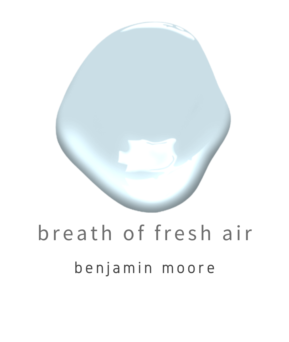
You know that tranquil feeling you get when you lay down outside & stare up at the blue sky? Well you can bring that feeling inside your home with a soft sky blue color, like Benjamin Moore’s BREATH OF FRESH AIR. In a soft pale blue shade, it makes for a perfect color choice for any space n the home.
Image via Benjamin Moore
3
Warm Gray
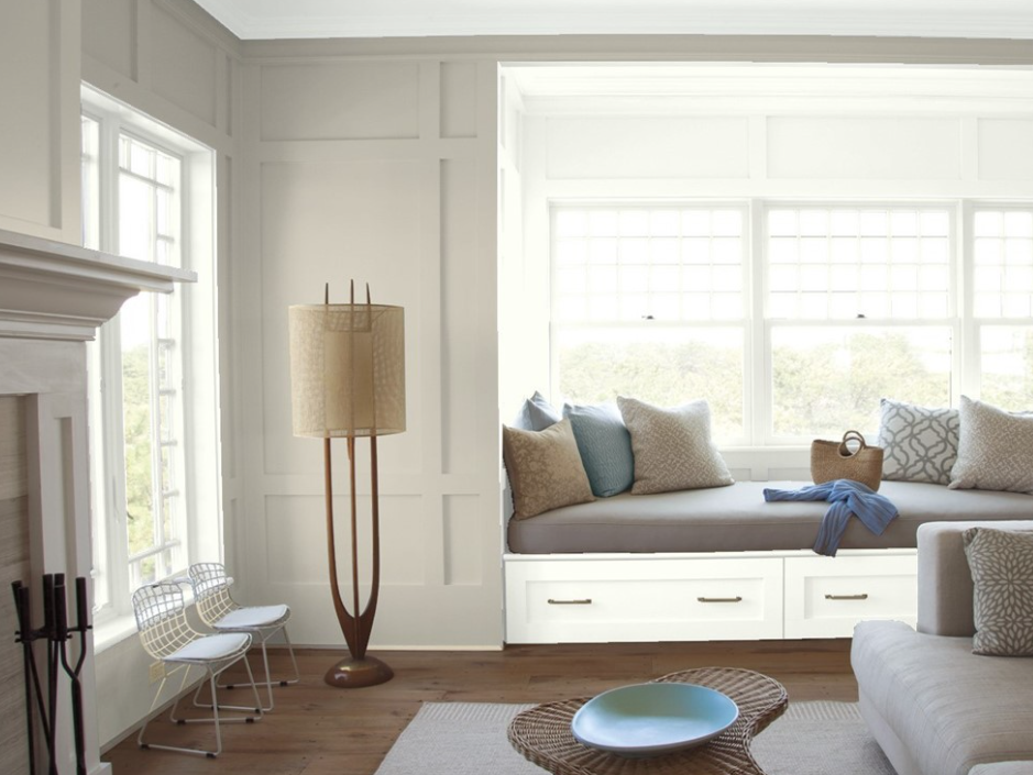
A warm-toned gray is great when you want a neutral gray for the walls, but still want to feel uplifted and at ease. Opting for a gray color with warm undertones like Benjamin Moore’s REVERE PEWTER is the perfect greige color that works for any room in the house, from kitchen cabinets to all-over wall color.
Image via Benjamin Moore
4
Classic White
Not all white paint colors are the same, but with the right white, you can create a calming space that is still classically white. Sherwin Williams’ ALABASTER is a great white that adds warmth and helps create a calming atmosphere.
Other great classic whites are Farrow & Ball’s WIMBORNE WHITE & Sherwin Williams’ SNOWBOUND.
5
Blue Green
If you want a bold color that can also offer a sense of calm, a muted turquoise hue like Sherwin Williams’ QUIETUDE is a great pick. It’s vibrant enough to liven up a space, yet also makes for a soothing bedroom color to relax in.
6
Blue Gray
A serene blue like Benjamin Moore’s WATER’S EDGE is a wonderful way to add a blue color to a room that can still give you a sense of peace thanks to its gray, dusty undertones.
7
Pale Blue
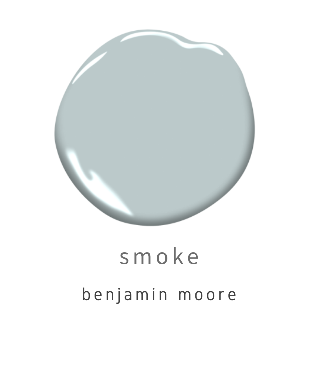
For more of a blue gray hue, opting for a pale blue paint like Benjamin Moore’s SMOKE offers you a touch of blue that is soft and serene. It makes for such a great option for any space in the home. Other similar colors equally great are Farrow & Ball’s PARMA GRAY NO.27 and Farrow & Ball’s LIGHT BLUE.
8
Creamy Gray
If you like the idea of gray , but still want it to be welcoming and relaxing, opting for a creamy color with warm undertones like Sherwin Williams’ AUSTERE GRAY is a great solution.
9
Creamy White
If you want to go a bit warmer with a white color, an alternative is a creamy white that can feel fresh and bright while also adding comfort and warmth, like Sherwin Williams’ ZURICH WHITE.
11
Earthy Taupe
If you want a warmer neutral, Farrow & Ball’s DROP CLOTH is the perfect earthy taupe color that adds warmth without being too harsh. It also pairs beautifully with warm white colors.
12
Sea Green
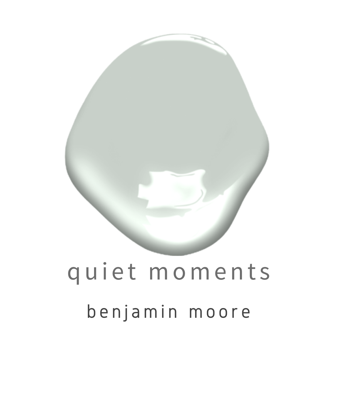
There is nothing more peaceful than a pretty sea green color like Benjamin Moore’s QUIET MOMENTS. Offering the perfect touch of pale green, this color is well-suited for a bathroom or bedroom where relaxation is most important.
Other great picks are Sherwin Williams’ SEA SALT and Farrow & Ball’s TERESA’S GREEN.
13
Cool Gray
Another way to go with gray is opting for a cool version of the color. In order to avoid it being too stark, opting for one like Benjamin Moore’s GRAY OWL is a perfect choice, as it is a cool gray color with blue and green undertones that easily adds a sense of calm to a space.
YOU MAY ALSO LIKE…


